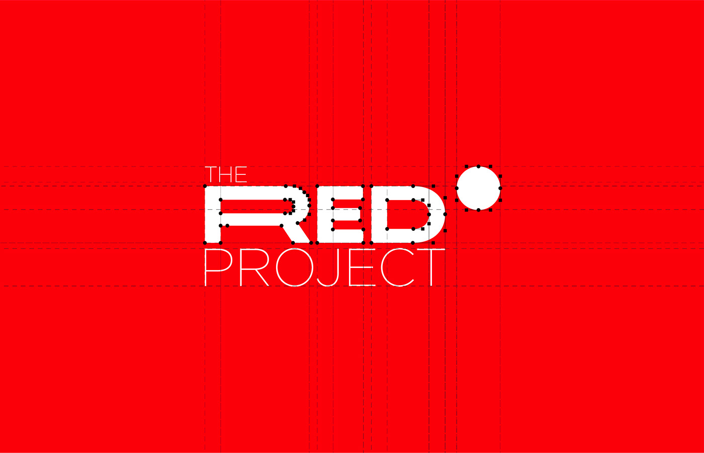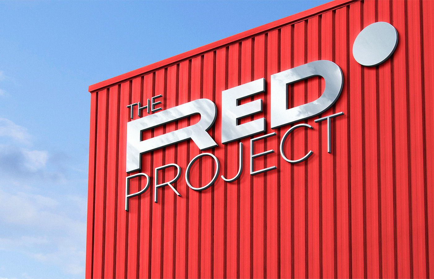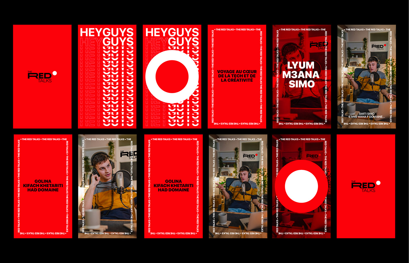
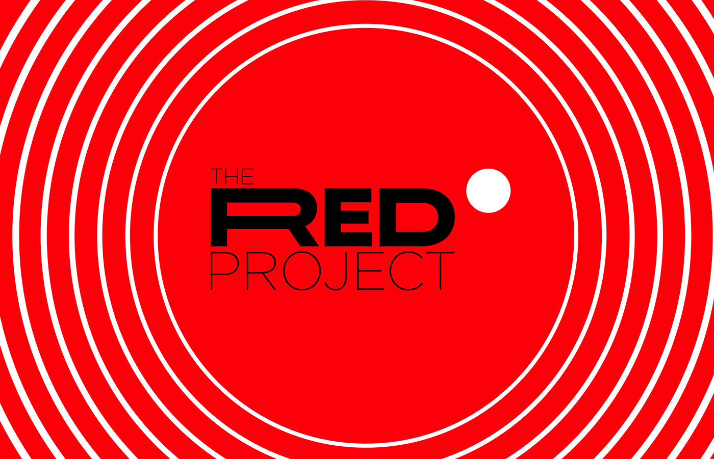
The red project Branding
Overview:
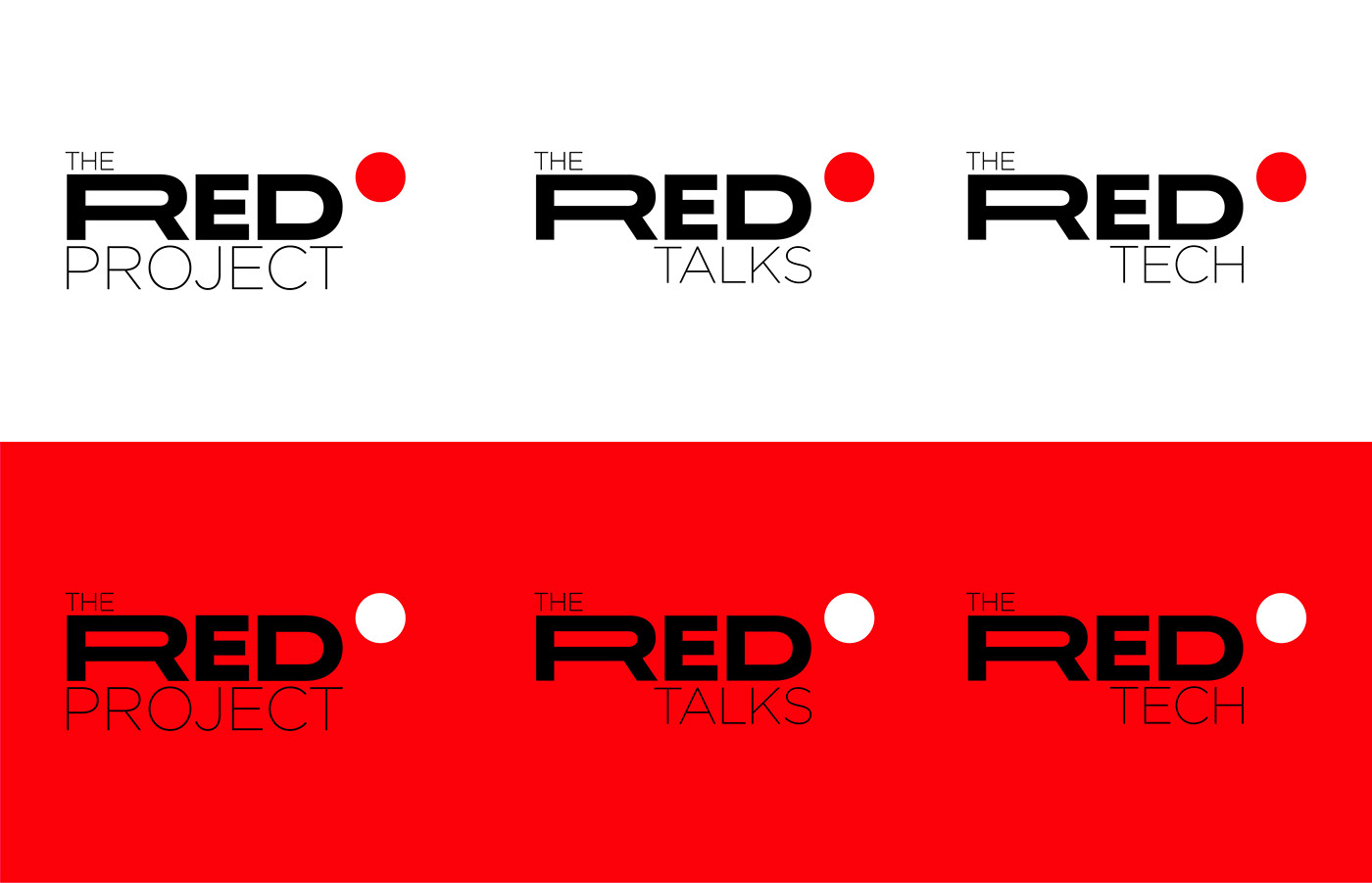
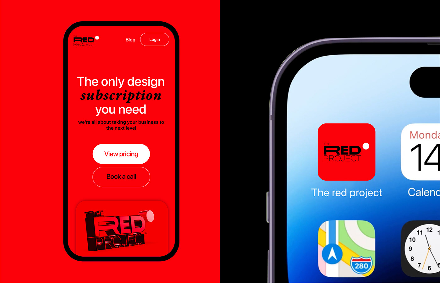
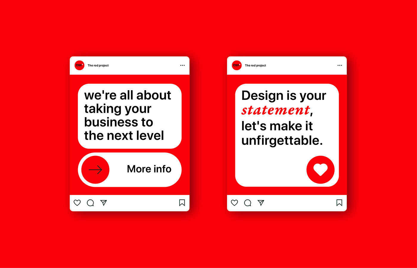
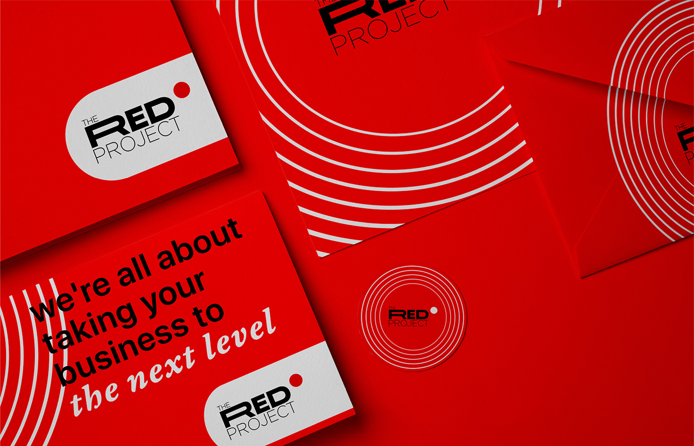
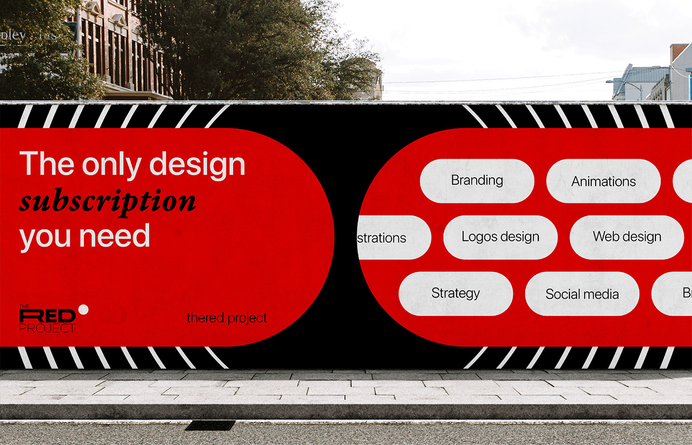
The red project is a design subscription service aimed at delivering continuous, high-quality design solutions to startups and established businesses alike. Our objective was to create a comprehensive brand identity that reflects our commitment to growth, innovation, and quality design. This case study outlines our process in developing The red project’s branding from conceptualization to final implementation, along with the development of a responsive, user-centric website designed to engage and convert potential clients.
Challenges:
Our primary challenge was to encapsulate the values of flexibility, creativity, and scalability intrinsic to the The red project service. The branding needed to communicate trustworthiness and professionalism while remaining approachable.
Results:
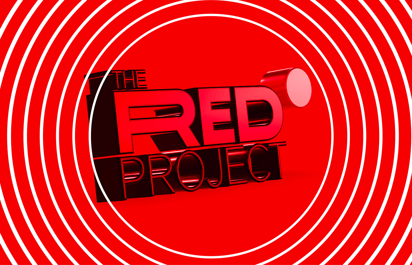
The new branding has significantly enhanced The red project’s market positioning, establishing a memorable presence that resonates with our target audience. The cohesive brand identity across all platforms has strengthened The red project’s reputation as a leader in design solutions.
Conclusion:
The red project branding exemplifies how thoughtful design can transform a service’s presentation and perception. Through meticulous research, creative design, we've crafted an identity and online presence that truly embodies the spirit of growth and innovation at the heart of The red project.